

100% Responsive Website Footer | Awesome Footer Design 2021
Trending footer design 2021


Hello guys, today I am going to show you how to create a 100% Responsive Website Footer, in this video, you will learn how do you create an awesome footer design using Html & Css
What is the footer in Html?
As the name suggests, the footer is the bottom part of a web page or a section.
What is the definition of a footer tag?
The <footer> tag defines the footer of a web page or a section. Usually, it contains contact details, navigation links, copyright information, etc.
What we can display in the footer?
- Privacy Policy
- Contact
- Address
- Navigation
- Social Icons
- Email Signup
- Copyright etc.
These are some basics we can use in our footer section in Html.
Simple Code sample
<footer>
  <ul>
      <li><a href="mailto:info@stackfindover.com"><i class="fa fa-envelope-open"></i> info@stackfindover.com</a></li>
      <li><a href="#"><i class="fa fa-twitter"></i>@stackfindover</a></li>
      <li><a href="#"><i class="fa fa-linkedin"></i>Linkedin</a></li>
  </ul>
</footer>
In this article, we will be going to build a responsive website footer using HTML and CSS, Let’s get started with Coding!
Responsive website footer design step by step
Step 1 — Creating a New Project
In this step, we need to create a new project folder and files(index.html, style.css) for creating an awesome responsive website footer. In the next step, you will start creating the structure of the webpage.
You may like these also:
Step 2 — Setting Up the basic structure
In this step, we will add the HTML code to create the basic structure of the project.
<!DOCTYPE HTML>
<html>
<head>
  <meta charset="utf-8">
  <meta name="viewport" content="width=device-width, initial-scale=1.0">
  <title>How to create an awesome responsive footer design using HTML and CSS</title>
  <link rel="stylesheet" type="text/css" href="style.css"> </head>
    <link rel="stylesheet" href="https://cdnjs.cloudflare.com/ajax/libs/font-awesome/4.7.0/css/font-awesome.min.css">
    <link rel="preconnect" href="https://fonts.gstatic.com">
    <link href="https://fonts.googleapis.com/css2?family=Poppins:wght@100;300;400;600;800&display=swap" rel="stylesheet">
<body>

</body>

</html>
This is the base structure of most web pages that use HTML.
Add the following code inside the <body> tag:
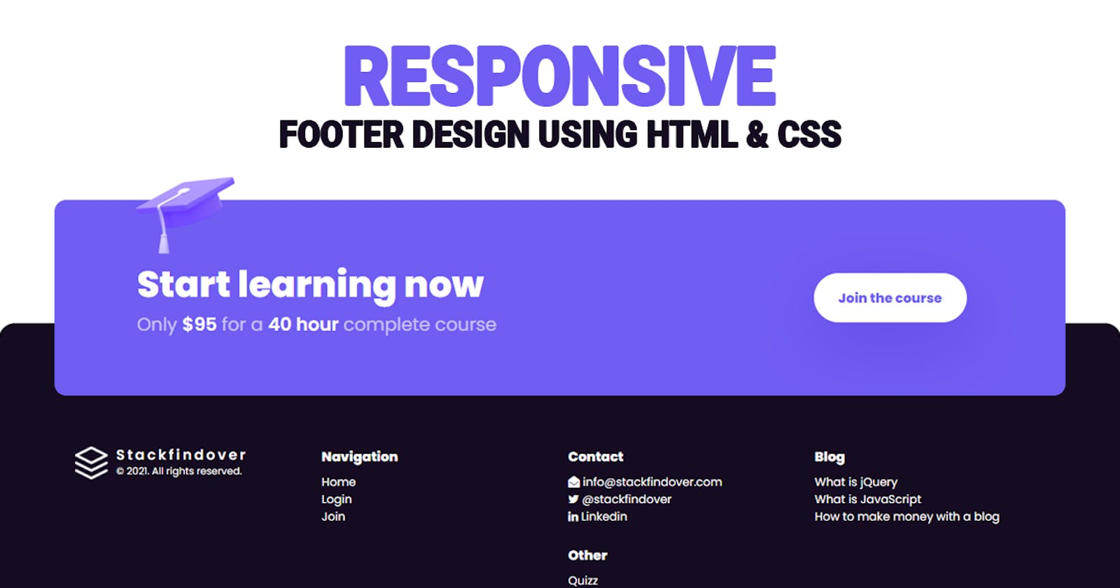
<footer class="footer">
        <div class="start-learning">
            <div class="footer-start">
                <div class="texts">
                    <h2 class="section-title">Start learning now</h2>
                    <h3 class="section-sub-heading">
                        <span>Only</span><strong>$95</strong>
                        <span>for a</span> <strong>40 hour</strong>
                        <span>complete course</span>
                    </h3>
                </div>
                <a href="#" class="button">
                    <span class="label">Join the course</span>
                </a>
                <img class="illustration" src="illustration-student.png" alt="illustration" width="120" height="94">
            </div>
        </div>

        <div class="inner">
            <div class="column is-logo">
                <a href="#" class="main-logo">
                    <div class="logo">
                        <img src="logo.png" alt="stackfindover">
                    </div>
                    <div class="logo-info">
                        <div class="text">Stackfindover</div>
                        <span class="copyright">© 2021. All rights reserved.</span>
                    </div>
                </a>
            </div>
            <div class="column is-nav">
                <div class="column-title">Navigation</div>
                <ul>
                    <li><a href="#">Home</a></li>
                    <li><a href="#">Login</a></li>
                    <li><a href="#">Join</a></li>
                </ul>
            </div>

            <div class="column is-nav">
                <div class="column-title">Contact</div>
                <ul>
                    <li><a href="#"><i class="fa fa-envelope-open"></i> info@stackfindover.com</a></li>
                    <li><a href="#"><i class="fa fa-twitter"></i>@stackfindover</a></li>
                    <li><a href="#"><i class="fa fa-linkedin"></i>Linkedin</a></li>
                </ul>
                <div class="column-title">Other</div>
                <ul>
                    <li><a href="#">Quiz</a></li>
                </ul>
            </div>

            <div class="column is-nav">
                <div class="column-title">Blog</div>
                <ul>
                    <li><a href="#">What is jQuery</a></li>
                    <li><a href="#">What is JavaScript</a></li>
                    <li><a href="#">How to make money with a blog</a></li>
                </ul>
            </div>
        </div>
    </footer>
Step 3 — Adding Styles for the Classes
In this step, we will add styles to the section class Inside style.css file
* {
    padding: 0;
    margin: 0;
    box-sizing: border-box;
    font-family: 'Poppins', sans-serif;
}
body {
    width: 100vw;
    height: 100vh;
    display: flex;
    align-items: flex-end;
    overflow: hidden;
}
ul { list-style: none; }
a { text-decoration: unset; }
a:hover { text-decoration: underline; }
ul > li > a { color:#fff; }
ul > li { line-height: 1.5em; }


.footer {
    display: block;
    width: 100%;
    position: relative;
    background: #150c21;
    padding: 150px 25px 50px 25px;
    border-top-left-radius: 20px;
    border-top-right-radius: 20px;
}
.footer-start {
    display: flex;
    position: relative;
    align-items: center;
    justify-content: space-between;
    max-width: 1280px;
    width: 90%;
    margin: auto;
    padding: 80px 100px;
    background: #705df2;
    border-radius: 15px;
}
.start-learning {
    position: absolute;
    left: 0;
    right: 0;
    top: -150px;
}
.footer .inner {
    display: flex;
    align-items: self-start;
    justify-content: space-between;
    column-gap: 20px;
    row-gap: 20px;
    max-width: 1180px;
    margin: auto;
    text-align: left;
}
.main-logo {
    position: relative;
    display: flex;
    align-items: center;
}
.main-logo .logo {
    display: inline-block;
    width: 40px;
    height: 40px;
    margin-right: 10px;
}
.main-logo .logo > img {
    display: block;
    width: 100%;
    min-width: 40px;
}
.logo-info {
    text-align: left;
    line-height: 20px;
}
.text {
    font-size: 17px;
    line-height: 17px;
    color: #fff;
    letter-spacing: .18em;
    font-weight: 600;
}
.copyright {
    color: #fff;
    font-size: 12px;
    line-height: 12px;
}
.footer .column {
    width: 100%;
    font-size: 14px;
    text-align: left;
}
.footer .column .column-title {
    font-weight: 700;
    font-size: 16px;
    margin-bottom: 0.5em;
    color: #fff;
}
.footer .column .column-title:not(:first-child) {
    margin-top: 1em;
}
.illustration {
    left: 8%;
    position: absolute;
    top: -28px;
}
a.button {
    display: inline-flex;
    position: relative;
    height: 60px;
    margin-right: 20px;
    flex-direction: row;
    align-items: center;
    overflow: hidden;
    background: #fff;
    color: #705df2;
    border-radius: 36px;
    font-size: 16px;
    font-weight: 700;
    padding: 0 30px;
    text-decoration: unset;
    box-shadow: 0px 24px 74px rgb(60 0 189 / 20%);
}
.section-title {
    font-size: 44px;
    font-weight: 700;
    color: #fff;
}
.section-sub-heading {
    font-size: 22px;
    font-weight: 400;
    color: #fff;
}
.section-sub-heading span {
    opacity: 0.6;
}
.section-sub-heading strong {
    font-weight: 600;
}

@media only screen and (max-width: 990px) and (min-width: 200px) {
    body {
        height: 200vh;
        overflow-y: scroll;
        overflow-x: hidden;
    }

    .footer .inner {
        display: grid;
        grid-template-columns: repeat(auto-fit, minmax(200px, 1fr));
    }
    .start-learning {
        position: unset;
    }
    .footer-start {
        width: 100%;
        display: block;
        padding: 30px 20px;
        margin: 30px 0;
    }
    .section-title {
        font-size: 30px;
    }
    .section-sub-heading {
        font-size: 18px;
    }
    footer.footer {
        padding-top: 0;
    }
    a.button {
        height: 50px;
        margin-top: 10px;
    }
    .column.is-logo {
        order: 4;
    }
}